Time for a solid update #5! So far the Photon project appears to be well on track — our work is scoped to what we think is achievable for Firefox 57, and we’re generally fixing bugs at a good rate.
Search Box?
If you’ve been paying attention to any of the Photon mockups and design specs floating around, you may have noticed the conspicuous absence of the search box in the toolbar (i.e. there’s just a location field and buttons). What’s up with that?
For some time now, we’ve been working on improving searching directly from the location field. You can already search from there by simply entering your search term, see search suggestions as you type, and click the icons of other search engines to do a one-off search with them instead of your default. [The one-off search feature has been in Nightly for a while, and will start shipping in Firefox 55.] The location bar now can do everything the search box can, and more. So at this point the search box is a vestigial leftover from how browsers worked 10+ years ago, and we’d like to remove it to reclaim precious UI space. Today, no other major browser ships with both a location field and search box.
That said, we’re being careful about understanding the impact of removing the search box, since it’s been such a long-standing feature. We’re currently running a series of user studies to make sure we understand how users search, and that the unified search/location bar meets their needs. And since Mozilla works closely with our search engine partners, we also want to make sure any changes to how users search is not a surprise.
Finally, I should note that this is about removing the search box as the default for _new_ Firefox users. Photon won’t be removing the search box entirely, you’ll still be able to add it back through Customize Mode if you so desire. (Please put down your pitchforks and torches. Thank you.) We’re still discussing what to do for existing users… There’s a trade-off between proving a fresh, clean, and modern experience as part of the upgrade to Photon (especially for users who haven’t been using the search box), and removing a UI element that some people have come to expect and use.
Recent Changes
Menus/structure:
Hamburger panel is now feature complete!
An exit/quit menu item was added (except on macOS, as the native menubar handles this).
One small feature-not-yet-complete: the library subview is reusing the same content as the library panel, and so won’t be complete until the library panel itself is complete.
It still needs a lot of work, items are missing, and the styling isn’t done. Landing this early allows us to unblock work in other areas of Photon (notably animations) that need to interact with this button.
We haven’t placed it into the toolbar by default yet. Until we do so, if you want to play with it you’ll need to manually add it from Customization mode.
We’re getting ready to enable the Photon structure pref by default on Nightly, and are just fixing the last tests so that everything is green on our CI infrastructure. Soon!
Animation:
Landed a patch that allows us to move more of our animations to the compositor and off of the main thread. Previously, this optimization was only allowed when the item’s width was narrower than the window, now it’s based on available area. (Our animations are using very wide sprite sheet “filmstrips” which required this — more about this in a future update).
Work continues on animations for downloads toolbar button, stop/reload button, and page loading indicator. The first two have gone up for review, and unfortunately we found some issues with the plan for the downloads button which requires further work.
Preferences:
Finalized spec for the preferences reorg version 2. The team will now begin implementation of the changes.
The team is working on improving search highlighting in about:preferences to include sub-dialogs and fixing some highlight/tooltip glitches.
One of the most obvious changes this week was the removal of the window drag space above the tabs. The tabs are now flush with the top of the window. To allow for dragging the window, we’ve increased the space to the left of the first tab.
Enabled the basic onboarding overlay on about:newtab and about:home. Now you can see a little fox icon on the top-left corner on about:newtab and about:home on Nightly! (Here’s the full spec for what will eventually be implemented. We’re working on getting the first version ready for Firefox 56.)
We now have a test checking which JS components and modules are loaded at which phase of startup, and started taking things off app-startup. These tests help ensure we don’t accidentally regress improvements to Firefox startup… We’ve already made some fixes where code that was supposed to load lazily was being loaded during startup, and these tests will catch that.
Welcome to Photon update #4! [Yes, another update this week. I’ve caught up with the backlog, so these updates should now reflect recent work over the last 7-10 days.]
Let’s first talk about a couple of projects that overlap with Photon and have led to some questions about how things fit together.
Quantum Flow and Photon
Quantum Flow is a project to find and prioritize fixing performance issues across the browser. We’ve found and/or fixed hundreds of bugs so far, tagged “[qf:p1]” in Bugzilla. Photon is a project to refresh Firefox’s UI, which also has a major performance component. Photon also has a big bug tree of front-end performance issues found and/or fixed.
So, hey, are these separate projects? Are we duplicating effort? The answer is “no” to both.
Quantum Flow started off with an emphasis on platform bugs, since web content performance is, y’know, a pretty important consideration for a web browser. The Photon project got rolling well after Quantum Flow had begun, and is simply the front-end complement to Quantum Flow’s performance investigations. The two projects are basically just different views into the same underlying work, and are coordinating very closely.
The Photon performance work is a little more structured than Quantum Flow as a whole, though. We’ve clustered the front-end performance bugs into about 10 areas of specific types of bugs or UX interactions. These are not the only areas of front-end performance, but are the ones we want to focus on for around the Firefox 57 timeframe.
Photon Mobile
The main focus of Quantum and Photon is Desktop Firefox. However, the mobile team will be doing a visual refresh of Firefox on iOS and Android to fit in with the new Photon design. They’ll be updating iconography and colors, as well as making the page loading indicators, menus, toolbars, and tab tray more consistent across iOS and Android. It’s also worth noting that Firefox on Android will still benefit from some of the Quantum improvements, since it’s also built on top of Gecko (on iOS we use WebKit, due to Apple’s platform restrictions).
Recent Changes
Here’s what’s happened in Photon this week.
Menus/structure:
Page action menu is taking shape – now has “Send to device” and bookmarking functionality. Pocket functionality is next on the list.
Long overdue maintenance and performance improvement work on panels, panelmultiviews and their transitions is ongoing, getting better every day.
Customization context menus and customize mode improvements have landed – customize mode is now more usable when the photon pref is toggled. We’re getting closer to toggling that pref on nightly.
Sidebar switcher improvements have landed. You can now move the sidebar to the left or right side, WebExtension sidebars are now listed, and some styling improvements have been made. When the sidebar button has also been updated this part of the project will be nearly done.
Initial patches for the new Library panel are awaiting review.
Animation:
Work continues on animations for downloads toolbar button, stop/reload button, and page loading indicator – but these haven’t landed yet.
Looked into SVG spritesheet production+optimization with SVGO plugins. This allows us to both to cleanup the SVG markup and optimize out some of the poor SVG generated by graphics editors.
Preferences:
We’ve decided to hold back the preferences reorg until Firefox 56. As previously noted, we’re planning on making some further revisions to the preferences reorg that has already landed in Nightly. They’re not large in scope, but 55 goes to Beta in just a few weeks (June 12th), and we want to make sure we get things right before shipping it to Beta or Release.
Updated the strings in the new performance page, added a search icon to the search field, and fixed a number of other small bugs.
Visual redesign:
The title bar is now dark by default on Windows 10. It’s a pretty striking look, and we think you’ll like it. A similar change for OS X is coming.
The dark purple has led to at least one interesting reaction. 😉
The arrow in the back button got a bit smaller. This makes it consistent with the forward arrow – which is especially important for use in Compact Mode, where both are styled identically (i.e. no circle around the back button).
Windows 7 no longer has a custom toolbar background color. It was bluish, and is now just a normal grey.
Started to remove the “compact” from the “compact light/dark” themes that shipped in Firefox 53. Wait, wait. Hold your fury! With Photon, “compact” will simply be a mode independent of any particular theme. You’ll still be able to have a compact-dark theme. But can also have the default theme be compact, or have a non-compact dark theme. Or use a 3rd party theme in compact mode.
Coordinating with the Activity Stream project to finalize automigration UI. Also discussing impact to the onboarding tour, as Activity Stream will only be doing a limited rollout (5% of users) in Firefox 56. Adapting the tour to the current (pre-Activity Stream) about:home and New Tab page introduces some complications and extra work.
Completed a User Research study to better understand why users download Firefox and what their expectations are.
Performance:
Even more sync reflow tests are being written, as well as a test to list files loaded early during startup. These help ensure we don’t regress the fantastic performance improvements that have been made so far.
We got some nice contributions, especially a couple fixes from Dão for sync reflows in tab interactions.
The last thing causing NSS initialization before first paint is captive portal detection, and should be fixed soon.
Felipe Gomes is joining the Photon Performance team, and will focus initially on jank caused by code running off of timers. He’ll have an intern starting soon who we expect will start by fixing some main thread IO bugs. Also, the rest of the Photon team will be starting to use some of their time to begin working on other performance bugs.
Work on the new application menu is nearing completion. Edit controls and Firefox Account status have been added, along with keyboard navigation. The “exit” and “zoom” controls are the last remaining features to implement.
The new overflow menu panel is done, except for polish and bug fixes.
The above are still behind the browser.photon.structure.enabled while we finish initial development, but we expect to turn them on by default (in Nightly) in the next couple of weeks.
The new sidebar switcher has landed. You can change what’s displayed in the sidebar (bookmarks, history, synced tabs) from at control at the top of the sidebar itself.
Work on the new Library button is starting.
Animation:
Work continues on animations for downloads toolbar button, stop/reload button, and page loading indicator – but these haven’t landed yet.
CSS changes for compact and touch modes has landed (but needs more plumbing before it’s activated).
Lots of small regression fixes.
History sidebar style changes being worked on.
Onboarding:
The skeleton of the onboarding overlay system add-on is under review. This will initially be used to introduce new Firefox users to some of the great features of Firefox they might not otherwise know about. Later, we’ll be using this same framework to help introduce existing Firefox users to the changes coming in Firefox 57. Here’s a short GIF from the prototype showing what the experience is like, starting from a badge on the new-tab page:
Other improvements to the first-run experience are planned to ship in Firefox 55: a better download page, updated stub installer, removing the default-browser prompt, and a less intrusive data-privacy notice. We want to help new users start using Firefox without annoyances or hassle.
Performance:
More rigorous reflow tests have landed for window opening, tab opening and tab closing. More tests coming up for windows and tabs, and the AwesomeBar.
That’s right! Time for another Photon Engineering Newsletter! (As I gradually catch up with real-time, this update covers through about May 16th).
May got off to a busy start for the Photon team. As I mentioned in last week’s update, the team has largely shifted from the planning to implementation, so visible changes are starting to come quickly.
Work Week
A particularly big event was the Photon team gathering in Mozilla’s Toronto office for a work week. About 50 people from Engineering, UX, User Research, and Program Management gathered, from all over the world, with a focus on building Photon. Mozilla operates really well with distributed/remote teams, but periodically getting together to do things face-to-face is super useful to work through issues more quickly.
It was really terrific to see so many people coming together to hack on Photon. We got a lot done (more on that below), saw some great demos, and the energy was high. And of course, no workweek is complete without UX creating some fun posters:
One important milestone reached during the week was setting the initial scope for what’s going to be included in Photon (or, more bluntly, what’s NOT going to be part of Photon when it ships in Firefox 57). We’re still refining estimates, but it looks like all the major worked planned for Photon can be accomplished. Most things placed in the “reserve backlog” (meaning we’ll do it if there’s extra time left, but we’re not committing to do them) are minor or nice-to-have things.
This is probably a good spot to talk a little more about our schedule. Firefox 57 is the release that Quantum and Photon are targeting. It’s scheduled to ship on November 14th, but there are important milestones before then… September 22nd is when 57 enters Beta, after that point it’s increasingly hard to make changes (because we don’t want to destabilize Firefox right before it ships). August 7th is when Nightly becomes version 57. This is also our target date to be complete with “major work” for Photon. This might seem a little surprising, but it’s due to the recent process change that removed Aurora. Under the old release schedule, August 7th is when Nightly-57 uplifted to Aurora (beginning ~12 weeks of stabilization before release). We want to keep the same amount of stabilization time (for a project as big as Photon there is _always_ fallout and followup work), so we kept the same calendar date for Photon’s target. This doesn’t mean we’ll be “done” on August 7th, just that the focus will be shifting from implementing features to fixing bugs, improving quality, and final polish.
And now for the part you’ve all been waiting for, the recent changes!
Recent Changes
Menus/structure:
The page action menu (aka the “…” button at the end of the URL bar) got the first menu items added to it, Copy URL and Email Link. More coming, as this becomes the standard place for “actions you can perform with this page” items.
The new hamburger menu is coming along, although still disabled by default (via the browser.photon.structure.enabled pref). Items for character encoding, work offline, and the devtools submenu have been added to it.
The new overflow menu (also disabled by default, same pref) is nearing completion with 2/3 of the bugs fixed. This menu is now shown in customize mode (instead of the old hamburger menu); so instead of only showing icons that couldn’t fit in the navbar (e.g. because you made your window too narrow), it’s the new place you can customize with buttons you want to be easily accessible without always taking up navbar space.
URL that are longer than the location box can display now fade out at the end.
Minor update to the about:privatebrowsing page (shown when opening a new private window).
Upcoming work on compact/touch modes for the toolbar and more toolbar button style changes.
Onboarding:
Running Funnelcake tests for the new tour notification.
Built a prototype of the new tab page tour overlay at the workweek.
Will be adding new automigration UI to the Activity Stream new tab page. Users trying Firefox for the first time will no longer immediately see the old data migration wizard (which makes for a pretty poor first impression). Instead, Firefox will automatically import from your previous browser, so you launch straight into Firefox and can see your data. There’s also a clear message indicating what happened, and giving you the choice to keep (or not) the data, or try importing from a different browser. This screencast shows the general flow:
Performance:
Florian landed a massive series of patches (assisted by an automated code-rewriting tool) that switches use of Task.jsm/yield to ES7 async/await. The native ES7 code is more efficient, and we’ve often seen the older Task.jsm usage show in the profiler. This also helps with modernizing Firefox’s front end, which extensively uses JavaScript.
The animation shown when opening a window is now suppressed for the first window to be opened.
Tab navigation and restoring now cause less visual noise in the tab title, by skipping the display of unnecessary text (e.g. “Loading” and “New Tab”).
A fewthingshave been moved off the startup path, so that Firefox launches faster.
Well, hello there. Let’s talk about the state of Photon, the upcoming Firefox UI refresh! You’ve likely seen Ehsan’s weekly Quantum Flow updates. They’re a great summary of the Quantum Flow work, so I’m just going to copy the format for Photon too. In this update I’ll briefly cover some of the notable work that’s happened up through the beginning of May. I hope to do future updates on a weekly basis.
Our story so far
Up until recently, the Photon work hasn’t been very user-visible. It’s been lots of planning, discussion, research, prototypes, and foundational work. But now we’re at the point where we’re getting into full-speed implementation, and you’ll start to see things changing.
Photon is landing incrementally between now and Firefox 57. It’s enabled by default on Nightly, so you won’t need to enable any special settings. (Some pieces may be temporarily disabled-by-default until we get them up to a Nightly level of quality, but we’ll enable them when they’re ready for testing.) This allows us to get as much testing as possible, even in versions that ultimately won’t ship with Photon. But it does mean that Nightly users will only gradually see Photon changes arriving, instead of a big splash with everything arriving at once.
For Photon work that lands on Nightly-55 or Nightly-56, we’ll be disabling almost all Photon-specific changes once those versions are out of Nightly. In other words, Beta-55 and Beta-56 (and of course the final release versions, Firefox-55 and Firefox-56). That’s not where we’re actively developing or fixing bugs – so if you want to try out Photon as it’s being built, you should stick with Nightly. Users on Beta or Release won’t see Photon until 57 starts to ship on those channels later this year.
The Photon work is split into 6 main areas (which is also how the teams implementing it are organized). These are, briefly:
1. Menus and structure – Replaces the existing application menu (“Hamburger button”) with a simplified linear menu, adds a “page action” menu, changes the bookmarks split-button to be a more general-purpose “library menu”, updates sidebars, and more.
2. Animation – Adds animation to toolbar button actions, and improves animations/transitions of other UI elements (like tabs and menus).
3. Preferences – Reorganizes the Firefox preferences UI to improve organization and adds the ability to search.
4. Visual redesign – This is a collection of other visual changes for Photon. Updating icons, changing toolbar buttons, adapting UI size when using touchscreens, and many other general UI refinements.
5. Onboarding – An important part of the Photon experience is helping new users understand what’s great about Firefox, and showing existing users what’s new and different in 57.
6. Performance – Performance is a key piece throughout Photon, but the Performance team is helping us to identify what areas of Firefox have issues. Some of this work overlaps with Quantum Flow, other work is improve specific areas of Firefox UI jank.
Recent Changes
These updates are going to focus more on the work that’s landing and less on the process that got it there. To start getting caught up, here’s a summary of what’s happened so far in each of the project areas though early May…
Menus/structure: Work is underway to implement the new menus. It’s currently behind a pref until we have enough implemented to turn them on without making Nightly awkward to use. In bug 1355331 we briefly moved the sidebar to the right side of the window instead of the left. But we’ve since decided that we’re only going to provide a preference to allow putting it on the right, and it will remain on the left by default.
Animation: In bug 1352069 we consolidated some existing preferences into a single new toolkit.cosmeticAnimations.enabled preference, to make it easy to disable non-essential animations for performance or accessibility reasons. Bugs 1345315 and 1356655 reduced jank in the tab opening/closing animations. The UX team is finalizing the new animations that will be used in Photon, and the engineering team has build prototypes for how to implement them in a way that performs well.
Preferences: Earlier in the year, we worked with a group of students at Michigan State University to reorganize Firefox’s preferences and add a search function (bug 1324168). We’re now completing some final work, preparing for a second revision, and adding some new UI for performance settings. While this is now considered part of Photon, it was originally scheduled to land in Firefox 55 or 56, and so will ship before the rest of Photon.
Visual redesign: Bug 1347543 landed a major change to the icons in Firefox’s UI. Previously the icons were simple PNG bitmaps, with different versions for OS variations and display scaling factors. Now they’re a vector format (SVG), allowing a single source file to be be rendered within Firefox at different sizes or with different colors. You won’t notice this change, because we’re currently using SVG versions of the current pre-Photon icons. We’ll switch to the final Photon icons later, for Firefox 57. Another big foundational piece of work landed in bug 1352364, which refactored our toolbar button CSS so that we can easily update it for Photon.
Onboarding: The onboarding work got started later than other parts of Photon. So while some prototyping has started, most of the work up to May was spent finalizing the scope and design of project.
Performance: As noted in Ehsan’s Quantum updates, the Photon performance work has already resulted in a significant improvement to Firefox startup time. Other notable fixes have made closing tabs faster, and work to improve how faviconsare stored improved performance on our Tp5 page-load benchmark by 30%! Otherfixes have reduced awesomebar jank. While a number of performance bugs have been fixed (of which these are just a subset), most of the focus so far has been on profiling Firefox to identify lots of other things to fix. And it’s also worth noting the great Performance Best Practices guide Mike Conley helped put together, as well as his Oh No! Reflow! add-on, which is a useful tool for finding synchronous reflows in Firefox UI (which cause jank).
That’s it for now! The next couple of these Photon updates will catch up with what’s currently underway.
About a year and a half ago, I started work on a fun little project. I’ve been dabbling with it on-and-off, and now it’s finally finished. So I thought I’d post a retrospective, as the process and challenges along the way were just as enjoyable as the end result.
It all began with a tweet that randomly popped into my head one day:
How do I convert between metric and imperial fucks-given?
Sean Martell replied with a classic GIF, and something about the combination of tweets made me start itching to build a real, physical version. The basic plan came together quickly, but I didn’t realize that it would be a long and meandering path through researching GIFs, vintage electronic hardware, nitpicky laser printer output, metalwork, 3D modeling/printing, and more.
I think the finished result is pretty good:
GIVE-A-FUCK-O-METER
Here’s a bit more about the process of building it.
Research and Foundation
The first thing I had to do was some due-diligence: what are the essential qualities of meme-meter? After extensive research on every such GIF I could find, I knew exactly what I wanted. A meter with a retro feel, a realistic face that was scientific and precise, and a needle that jittered around the bottom of the scale to indicate approximately “zero fucks given”. In metric.
All the GIFs
The next day, I jumped on Ebay to scope out some vintage analog meters, and got unbelievably lucky: a pair of Triolab voltmeters from the early 1960s for just $16 (plus shipping). One was rather ugly and worn, but the other was absolutely perfect. Retro, with just enough wear to be authentic, yet in excellent condition. A compact 4-inch cube with a hefty weight makes it perfect for desktop display. And, oh, the details – industrial black crinkle-paint finish, sturdy knobs, brass and stainless steel screws, and a classic aluminum product nameplate.
The insides are equally amazing. Lots of colorful antique components (even a vacuum tube!) on a wire-wrapped board, complete with that distinctive “old electronics smell” that may or may not be known to the state of California as causing cancer. Even the cabling just oozes quality, neatly bundled with lacing that’s rare to see today outside of aerospace applications.
Old-skool components
As an added bonus, there’s an instrument calibration label on the top from “Martin Marietta Corporation, Aerospace Division,” certifying that it’s within 2% of manufacturer’s specs as of November 1963. Plus an earlier ink stamp from June 1961. They help make it feel like it fell into a time warp straight from a mid-century laboratory. (I’d love to know what this meter was originally used for – Martin Marietta was probably best-known for the Titan family of rockets and ICBMs, so something involving them might be a good guess.)
Calibration sticker and stamp
Unfortunately, the paper sticker was in desperate need of conservation; it was starting to degrade and was very fragile. One corner was missing, and another was barely hanging on. Not too surprising, as it was a simple tag meant to be replaced after 6 months, and not designed for a 50-year lifetime. To fix it I used some adhesive to fasten the loose edges, and a clear “Ultra Matte” polyurethane paint to stabilize the surface. I was pleased with the result, which maintains the appearance of plain (unpainted) paper. [Aside: the tech who originally applied the label was very sloppy with the glue, if you look closely that’s what you see around the edges, not my work!]
Face Time
My first major undertaking was to design a new faceplate for the meter. I used Acorn to draw the scale using vector lines and circles; most of the work was tedious but straightforward. One handy trick was to scan the original faceplace at 600dpi on the office scanner/copier, and use that as a template for accurate physical sizing.
I spent a disturbing amount of time in the vintage typeface rathole. My first thought was to use Futura, which is commonly used in aerospace instrumentation (notably, the flight controls on Apollo and the Space Shuttle). But it didn’t feel quite right – ironically(?) too modern. I also looked through piles of other typefaces, named and unnamed, from hobbyists who recreate flight controls on vintage aircraft. In the end, I just used the modern Avenir Next Condensed font that comes with OS X for the main text. It’s a faithful nod to the original meter faceplace. I also matched typefaces as best I could for the smaller labels, and redid the “triolab” logo to make it sharper than the original scan.
Once printed, I carefully disassembled the analog meter, flipped over the original aluminum faceplate, and affixed my version with some spray mount.
Before and after. Well, after and before. You know what I mean.
Laser Printer Resolution
Attention to detail was important to me on this project, but one issue I didn’t catch until too late (and never fully resolved) was print quality. Despite my work being in resolution-independent vector format, I consistently got suboptimal output when printing. Here’s an example of a 10pt capital letter “K” printed 3 different ways, photographed through a USB microscope:
Bad K, bad K, ok K.
On the left is output from Acorn, as printed on my 10 year old home HP LaserJet 1012 (600dpi), and in the middle as printed on a new Ricoh C2503 (1200dpi). The rightmost is the same letter “K” printed on my HP, but using TextEdit instead of Acorn. I tried myriad combinations of printing to intermediate formats, source bitmap resolutions, and printer settings, but the results were always the same… Anything coming from Acorn or Photoshop came out with bumpy edges, while output from a text editor was crisp.
My assumption is that something in the pipeline was rasterizing everything, and the printer was just doing it’s best to blithely print a greyscale bitmap with halftones. Eventually I got slightly better, but not great, output by printing to an absurdly high-resolution PDF, filtering to B&W and downsizing with ImageMagick, and then printing the final 1-bit depth image. I’m curious if a dedicated vector program like Adobe Illustrator would have made this Just Work, or if there’s even any good way to do this. Back in the day one could have hand-crafted some PostScript/PCL for this, but I’m not sure exactly how modern printing pipelines work.
Who knew that 1200dpi wasn’t enough for good black-and-white output?! (This guy, apparently.)
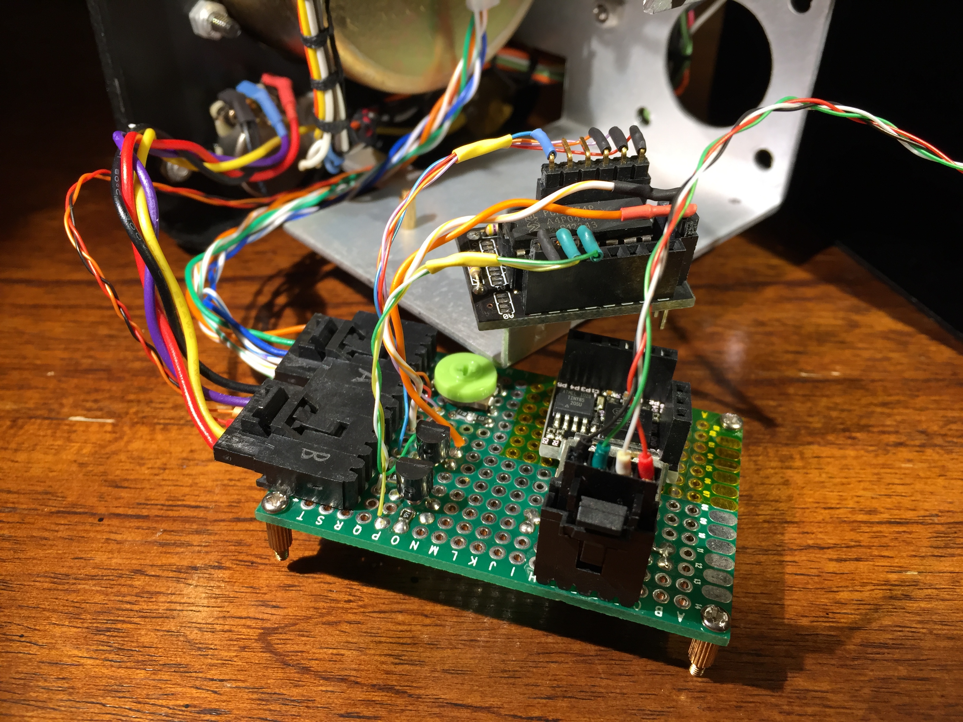
Electronics
The electronics on the new meter are slightly overkill, but are what I had sitting around. At the core is a Digispark (basically a tiny Arduino clone), with an IO port expander and a custom protoboard for gluing everything together.
New-skool components
The Digispark controls the meter through a PWM output. Analog meters are driven by rather small currents, and I needed just 206 microamps to drive it full-scale, which is trivial for the microcontroller to provide directly. At 4.65v that needs about 22kΩ (thanks, Ohm’s Law!), so I used a couple resistors summing to 20kΩ and a 4kΩ trimpot for fine-tuning… That lets the software simply use the PWM pin from 0-100% without having to worry about overdriving the meter. Doing so can actually make the needle stick at the over-100% point, and I didn’t want to risk having a software bug cause hardware damage. This meter does not go to 11.
Of course, no Arduino project is complete without some LEDs! I mounted an I2C-controlled RGB BlinkM LED inside the meter, behind a small sheet of milky-white plastic sheeting to diffuse the light. I have it set to generate an warm orange glow reminiscent of a vacuum tube, but it can be changed to other hues with the front-panel knobs (as read by the Digispark). The BlinkM has 24-bit color resolution, which really turns out to be inadequate. The exact color of orange I want (a mix of red + green) is tricky for it to reproduce — the human eye is very sensitive to green, and there is a single 8-bit level that looks about right. One level less and it’s too red, one level more and it’s too green. Next time I’d probably just use a dedicated monochrome orange LED at the right wavelength, or an RGB LED with ADC levels I can control better.
I also tossed in a couple extra white LEDs, just because I could. These have a higher power draw, and are switched by transistors. But they ended up not really working well for illuminating the meter at night, because they’re too far behind the faceplate. Oops.
The components I used were quite small – 0805 surface-mount resistors, 5mm×5mm PLCC LEDs, and 30-awg wire for connections. Some people hate working with stuff smaller than standard 0.1″ PTH parts, but I like the compactness and challenge. However, it’s essential to use a good soldering iron and wire strippers that can handle tiny wires. Also highly recommended: a steady hand, and a magnifying loupe or USB microscope for inspection.
When I was adding the control electronics, I didn’t want to totally gut the existing voltmeter components because they are so beautifully vintage. So they’re simply disconnected and left in-place. Similarly, I wanted to be respectful to the existing layout by carefully routing and weaving my new wiring harness. It’s completely hidden without the case being opened, but it was important to me, knowing what was inside.
Software
There’s not much to say about the software running on the Digispark, since it’s fairly simple. You can view it here. To make the meter’s needle jitter, it outputs a semi-random value near zero, with a rare outlier to make it bounce a bit more on occasion. I can’t make it twitch as hyperactively as the original GIF (there are physical limitations on how quickly the needle will move), but it’s still satisfactory. I also added some debouncing on the selector switch, using a small state machine and timeout. Probably over-engineered, but it was fun to write.
I did have to do some debugging with an oscilloscope, that was also fun! The code for adjusting the BlinkM LED color would sometimes fail to work — I’d tell it to change color, but nothing would happen. The interface to the BlinkM is an I2C bus, and so I used my oscilloscope to see what was happening. It’s got a built-in I2C decoder, but it was more enjoyable to learn how I2C works and decode the signaling by hand. The problem ended up being that the BlinkM device would sometimes fail to acknowledge a command. I’m not really sure why, but happened rarely enough, and was detectable in software, so I just added a retry for when a failure occurred.
Connections
The most stress-inducing aspect of the project was adding a micro-USB connector to power the whole thing. None of the existing holes in the Triolab case were big enough to accommodate a connector, so I’d have to make a new – and permanent – hole. Further, I wanted a nearly-invisible connector, but none of the commercially available panel-mount connectors I could find were suitable. They were all designed to bolt on top of a large hole in the mounting surface, as a large protruding lump of plastic.
So, I ended up designing a custom assembly for mounting a micro-USB connector and 3D-printing it. A little bit overkill, but it was a fun process to go through.
I’ve previously used Google’s SketchUp, but found it limiting. It seems well-suited to freeform artistic design, but less so for CAD-like design where one needs specific dimensions and layout. After looking at a number of options, I settled on OpenSCAD. It’s both free and Free, has some good tutorials, and allows for precision synthesis . Based on constructive solid geometry, it’s great for someone with a programming background, and reminds me a lot of playing with the POV-Ray raytracer years ago.
OpenSCAD
The connector I designed basically mounts to the back of the mounting panel, and is thus flush with the outside. I had it printed in Frosted Extreme Detail from Shapeways (16 micron resolution!) for just $15. I soldered my connecting wiring to a splashproof micro-USB connector, epoxied it into my 3D-printed connector, and then mounted that onto the meter’s case with silicone. The silicone gave a solid connection, but one that I can easily replace in the future when micro-USB is obsolete. This meter is over 50 years old, and USB format changes won’t be the death of it!
Connector with USB plug inserted
Why a splashproof connector? I wanted to pot (encase) my connector in epoxy for reliability, but from previous experience had learned that epoxy has a tendency to seep though any openings, and foul up the ability to insert the connecting cable. I hoped this connector type would be sealed and avoid that. As it turned out, even a “splashproof” connector still has tiny openings, and I had to spend an hour scraping out partially-cured epoxy from the insides. In the future, I would make my soldered connections, lightly seal up any superficial openings, and only then glue it into its final resting spot.
Another lesson learned is that it’s a pain-in-the-butt (A HUGE PAIN-IN-THE-BUTT!) to solder connecting wires to an extremely tiny micro-USB connector. (I suppose it’s still a good challenge and builds character. Or something.) The connector I used was really designed for surface mounting, but I manged to make it work with patience and plenty of flux. If I did it again, I’d reflow it to a tiny PCB adapter, which would make connecting the wires trivial.
Tiny tiny tiny
It all worked out pretty well, the connector is flush with the case and mounts perfectly into the hole I drilled for it. I thought about painting it black to blend in a bit more, but the fit looks so good that I was concerned that painting could just make it worse. It’s also easy enough to do later, or maybe if I eventually redo it as a USB-C connector…
USB pug in the back
Conclusion
This was a really fun project for me. It was stretched over a long period of time, but the end result was something that I was happy with, something that I learned from, and something that I hope others might find interesting too.
Ironically, I really gave a fuck about this zero-fucks-given meter!
That’s right! Everyone’s favorite dancing mascot is back, baby!
Back in 2008, Alex Polvi (of Firefox crop circle fame), departed Mozilla to found his own startup. In one of the most epic farewell emails of all time, he created Foxkeh Dance, a Mozilla flavor of the Internet-classic Hampster Dance site.
Alas, domains expire, and for the last 5 years foxkehdance.com has been the home of a domain squatter hoping to interest you in the usual assortment of spam. But a few weeks ago, I randomly checked the site, and discovered it was available for registration! So I grabbed the domain, and set about restoring it.
The ever-amazing Archive.org has a cached version of the original 7-year-old site from August 24th 2008… Mostly. It has the HTML, but not the images or background music. Luckily a couple of contemporaneous Mozilla community sites included copies of the animated images, and from that I was able to restore what I believe are original versions. (Update: it seems archive.org is now using these newly-restored images to fill in their incomplete cache. Curious.) While the original embedded “hamster.mp3” file is lost, I remember it a being a straight copy of the Hampster Dance site, and that’s easily available. Of course, the original site used plugins to play sound, so I’ve updated it to use a modern HTML5 <audio> replacement.
For those unfamiliar, Foxkeh is Mozilla Japan’s cartoon mascot. Recently it’s been the unofficial mascot of the new Tracking Protection feature in Firefox (butt flames and all). I hope we’ll see more of the ‘lil guy in the future!
Last Thursday (23 Oct 2014), North America was treated to a partial solar eclipse. This occurs when the moon passes between the Earth and Sun, casting its shadow onto part of our planet. For observers in the California Bay Area, the moon blocked about 40% of the sun. Partial eclipses are fairly common (2-5 times a year, somewhere on the Earth), but they can still be quite interesting to observe.
The first two eclipses I recall observing were on 11 July 1991 and 10 May 1994. The exact dates are not memorable; they’re just easy to look up as the last eclipses to pass through places I lived ! But I do remember trying to observe them with some lackluster-but-easily-available methods of the time. Pinhole projection seems to be most commonly suggested, but I never got good results from it. Using a commercial audio CD (which uses a thin aluminum coating) had worked a bit better for me, but this is highly variable and can be unsafe.
(In fairness, the equipment fits into a pocket, and it was a last-minute plan to drive 6 hours, round trip, for better viewing.)
For the transit of Venus a few days later — a very rare event that occurs only once ever 105 years — I switched to using my telescope for even better quality. You don’t look through it, but instead use it to project a bright image of the sun onto another surface for viewing.
I was excited to catch last week’s eclipse because there was an unusually large sunspot (“AR2192”) that was going to be visible. It’s one of the larger sunspots of the last century, so it seemed like a bit of an historic opportunity to catch it.
This time I took the unusual step of observing from indoors, looking out a window. This basically allows for projecting into a darker area (compared to full sunlight), resulting in better image contrast. Here’s a shot of my basic setup — a Celestron C8 telescope, with a right angle adapter and 30mm eyepiece, projecting the full image of the sun (including eclipse and sunspots) onto the wall of my home:
The image was obviously quite large, and made it easy to examine details of the large sunspot AR2192, as well as a number of smaller sunspots that were present.
I also switched to a 12.5mm eyepiece, allowing for a higher magnification, which made the 2-tone details of the main sunspot even more obvious. The image is a little soft, but not too bad — it’s hard to get sharp contrast at high zoom, and the image was noticeably wavering as a result of thermal convection withing the telescope and atmosphere. (Not to mention that a telescope mounted on carpet in a multistory building isn’t the epitome of stability — I had to stand very still or else the image would shake! Not ideal, but workable.)
As with the transit of Venus, it’s fun to compare my picture with that from NASA’s $850-million Solar Dynamics Observatory.
Observing this sunspot wasn’t nearly as exciting as the Carrington Event of 1859, but it was still a beautiful sight to behold. I’m definitely looking forward to the 21 August 2017 eclipse, which should be a fantastic total eclipse visible from a wide swath of the US!
I upgraded to a new MacBook about a week ago, and thought I’d use the opportunity to try living without Flash for a while. I had previously done this two years ago (for my last laptop upgrade), and I lasted about a week before breaking down and installing it. In part because I ran into too many sites that needed Flash, but the main reason was that the adoption and experience of HTML5 video wasn’t great. In particular, the HTML5 mode on YouTube was awful — videos often stalled or froze. (I suspect that was an issue on YouTube’s end, but the exact cause didn’t really matter.) So now that the Web has had a few additional years to shift away from Flash, I wanted to see if the experience was any better.
The short answer is that I’m pleased (with a few caveats). The most common Flash usage for me had been the major video sites (YouTube and Vimeo), and they now have HTML5 video support that’s good. YouTube previously had issues where they still required the use of Flash for some popular videos (for ads?), but either they stopped or AdBlock avoids the problem.
I was previously using Flash in click-to-play mode, which I found tedious. On the whole, the experience is better now — instead of clicking a permission prompt, I find myself just happy to not be bothered at all. Most of the random Flash-only videos I encountered (generally news sites) were not worth the time anyway, and on the rare occasion I do want to see one it’s easy to find an equivalent on YouTube. I’m also pleased to have run across very few Flash-only sites this time around. I suspect we can thank the rise of mobile (thanks iPad!) for helping push that shift.
There are a few problem sites, though, which so far I’m just living with.
Ironically, the first site I needed Flash for was our own Air Mozilla. We originally tried HTML5, but streaming at scale is (was?) a hard problem, so we needed a solution that worked. Which meant Flash. It’s unfortunate, but that’s Mozilla pragmatism. In the meantime, I just cheat and use Chrome (!) which comes with a private copy of Flash. Facebook (and specifically the videos people post/share) were the next big thing I noticed, but… I can honestly live without that too. Sorry if I didn’t watch your recent funny video.
I will readily admit that my Web usage is probably atypical. I’ve rarely play online Flash games, which are probably close to video usage. And I’m willing to put up with at least a little bit of pain to avoid Flash, which isn’t something fair to expect of most users.
But so far, so good!
[Coincidental aside: Last month I removed the Plugin Finder Service from Firefox. So now Firefox won’t even offer to install a plugin (like Flash) that you don’t have installed.]


